[코드잇] CSS 레이아웃
1. position
position
일반적인 글의 흐름에서 벗어나고 싶을 때 사용
속성값 : static, relative, absolute, fixed, sticky
- 위치의 기준 : position 으로 정하기
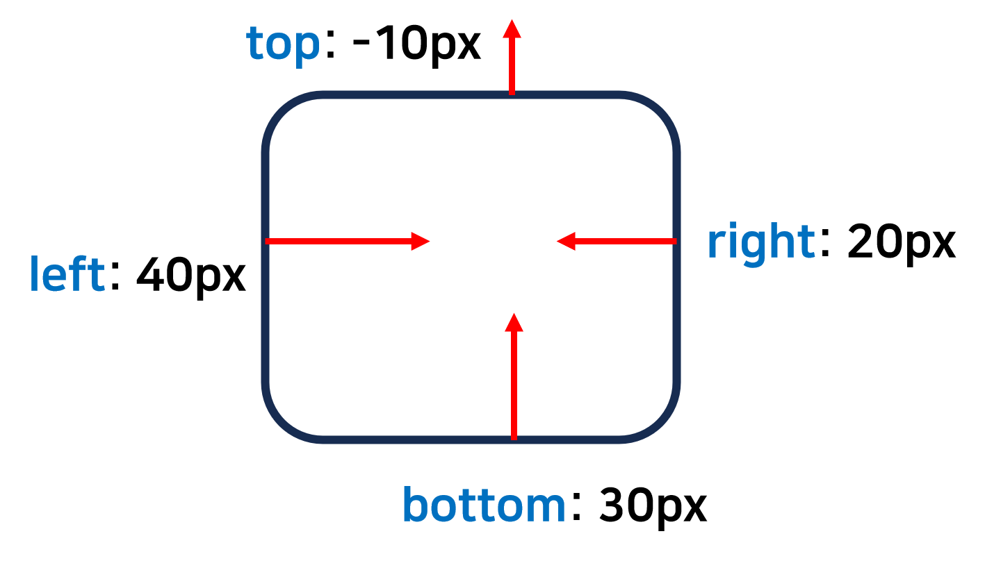
- 구체적인 위치 : top, right, bottom, left 으로 지정함.
ex.
이미지나 영상 위에 글자가 겹치기
화면 위쪽에 메뉴가 스크롤을 해도 떠있는 것처럼 글 흐름이랑 상관없이
static
position 속성의 기본 값
원래 있어야 할 위치에 배치
일반적인 글의 흐름을 따름
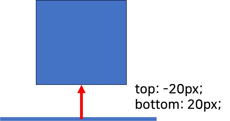
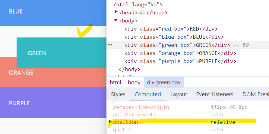
relative
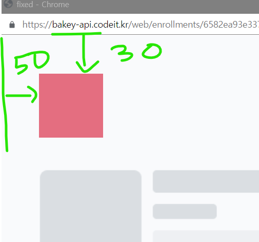
원래 위치를 기준으로 움직이고, 원래 있던 공간은 그냥 비워놓고 배치함.
- margin : 다른 요소들도 이동함.
- relative : 다른 요소들은 그대로 있음.
원래 있어야 할 공간에서 위쪽 30px 간격, 왼쪽 50px의 간격이 있도록 함.
.green {
  background-color: #32b9c1;
  position: relative;
  top: 30px;
  left: 50px;
}
.green {
  background-color: #32b9c1;
  position: relative;
  top: 30px;
  left: 50px;
}
position: relative로 지정했을 때, 왼쪽에 50px, 위쪽에 30px의 간격이 있도록 함.
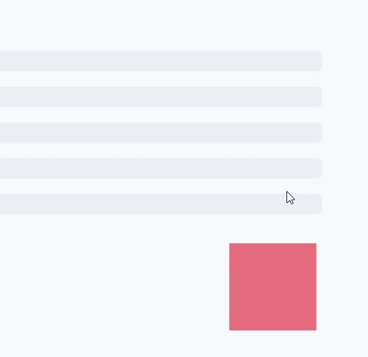
absolute
가장 가까운 포지셔닝이 된 조상요소를 기준으로 위치를 잡는것
포지셔닝 = static(기본값)이 아닌 다른 속성
기존의 배치에서 벗어나서 배치됨. 자리를 차지하지 않고 아예 빠져버림.
크기를 정해주지 않으면 안에 있는 내용(ex. 글자)만큼의 크기를 갖는다.
  <body>
    <div class="red">
      <div class="green">
        <div class="blue"></div>
        <div class="orange"></div>
      </div>
    </div>
  </body>
.green {
background-color: #32b9c1;
width: 300px;
height: 300px;
position: relative; /* */
top: 40px;
left: 90px;
}
.blue {
background-color: #5195ee;
width: 100px;
height: 100px;
position: absolute; /* position이 static이 아닌 조상요소 .green */
bottom: 40px; /* */
right: 10px;
}
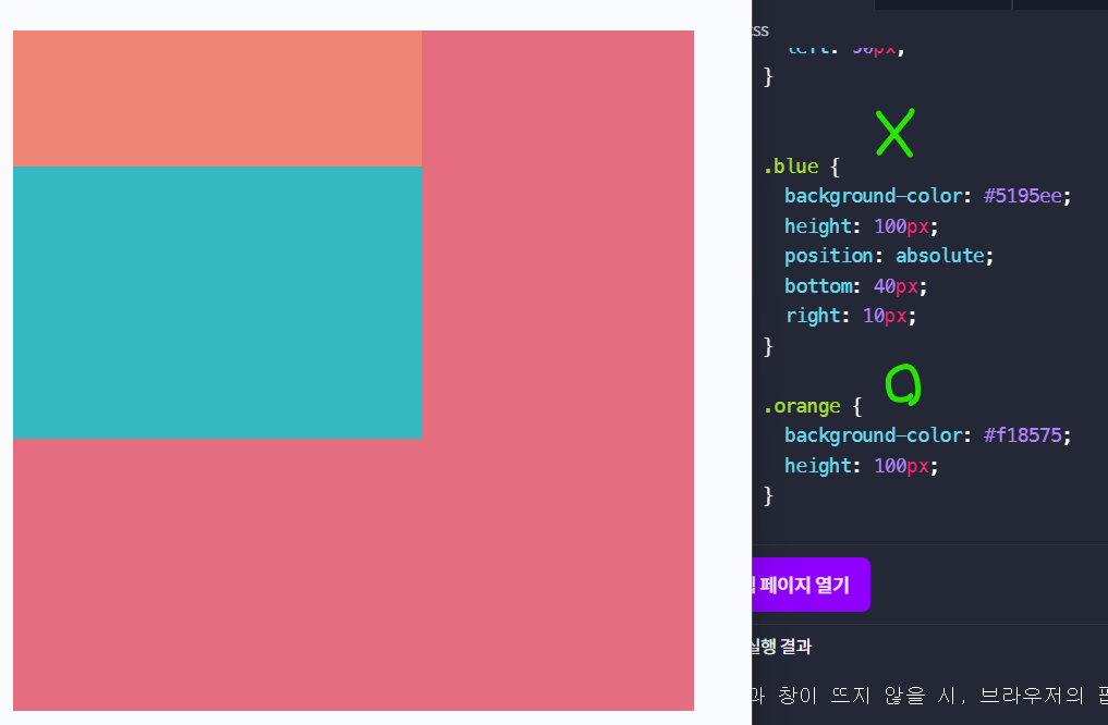
blue와 orange의 width를 없애줌.
orange : block display라서 부모 요소의 너비에 꽉 차도록 배치됨.
blue: 아예 보이지 않음.
absolute position을 부모 요소에 꽉 차도록 지정하는 방법
.green {
  background-color: #32b9c1;
  position: absolute;
  top: 0;
  right: 0;
  bottom: 0;
  left: 0;
}
.green {
background-color: #32b9c1;
position: absolute;
inset: 0;
}
green이 부모요소인 red에 꽉 찼기 때문에, red가 보이지 않음.
inset은 모든 방향에 대해 지정함.
fixed
브라우저 화면을 기준으로 배치함.
원래 있던 자리와 전혀 상관없음.
기존 배치에서 완전히 빠져서 자리를 차지하지 않음.
navigation에서 쓰임.
.red {
  background-color: #e46e80;
  width: 100px;
  height: 100px;
  position: fixed;
  top: 30px;
  left: 50px;
}
스크롤을 해도 고정되어 있음.
.red {
  background-color: #e46e80;
  width: 100%;
  height: 120px;
  position: fixed;
  top: 0;
  left: 0;
  right: 70px;
}
width: 100%를 설정하지 않으면 요소 안에 있는 내용만큼 크기를 차지함.
    <div class="main">
          <img class="skeleton" src="skeleton.png" alt="긴 글">
          <img class="skeleton" src="skeleton.png" alt="긴 글">
           <img class="skeleton" src="skeleton.png" alt="긴 글">
    </div>
.main {
margin-top: 120px;
}
위쪽 여백을 네비게이션 바만큼 주게 되면 내용부분과 겹치지 않게 됨.
sticky
요소를 웹브라우저에 달라붙도록 배치함.
fixed와 달리 원래 위치에서 공간을 차지하고 있음.
기본적으로 static 처럼 배치되는데 스크롤하다가 지정한 위치에 닿으면(브라우저 상단) fixed처럼 고정됨.
부모요소 안에 속해 있어서 부모요소가 화면 바깥으로 사라지면 같이 사라짐.
.red {
  background-color: #e46e80;
  width: 100%;
  height: 60px;
  position: sticky;
  top: 0px; /*화면 맨 위쪽에 닿았을 때 달라붙음*/
}
Z-index
요소의 앞뒤 순서를 정하는 것
숫자가 높을수록 더 앞쪽으로 보임. 값이 같은 경우 코드에서 더 아래쪽에 있는 태그가 앞쪽으로 보임.

스크롤 내리다보면 빨간색의 fixed는 잘 되는 반면, 파란색 사각형이 red div를 덮는 문제가 발생함.
기본적으로 코드 밑에 있을수록, 화면에서는 앞쪽으로 보임.
.red {
  background-color: #e46e80;
  width: 100%;
  height: 120px;
  position: sticky;
  top: 0;
  left: 0;
  z-index: 1; /* 수정 */
}
쌓임 맥락
- 문서의 루트 요소(<html>)
- position이 absolute이거나 relative이고, z-index가 auto가 아닌 경우
- position이 fixed이거나 sticky인 경우
- Flexbox나 Grid의 자식 중 z-index가 auto가 아닌 경우
- opacity가 1보다 작은 요소
쌓임 맥락 - CSS: Cascading Style Sheets | MDN
쌓임 맥락(stacking context)은 가상의 Z축을 사용한 HTML 요소의 3차원 개념화입니다. Z축은 사용자 기준이며, 사용자는 뷰포트 혹은 웹페이지를 바라보고 있을 것으로 가정합니다. 각각의 HTML 요소는
developer.mozilla.org
2. Flexbox
Flexbox
1차원으로 요소를 배치하는 방식 (가로 혹은 세로)
고려할 점
- 배치할 방향 : flex-direction
- 정렬하기 : justify-content, align-items
- 요소가 넘칠 때 : flex-wrap
- 요소 간격 : gap
- 크기 늘이거나 줄이기 : flex-grow, flew-shrink, flex-basis
배치 방향
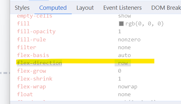
- flex-direction : row : 가로 방향, 왼쪽에서 오른쪽으로 배치됨.
- flex-direction: row-reverse : 가로 방향, 오른쪽에서 왼쪽으로 배치됨.
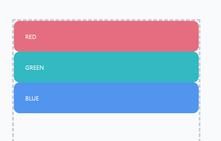
- flex-direction: column : 세로 방향, 위에서 아래로 배치됨.
- flex-direction: column-reverse : 세로 방향, 아래에서 위로 배치됨.
.container {
  border: 5px dashed #cacfd9;
  width: 500px;
  height: 500px;
  display: flex;
}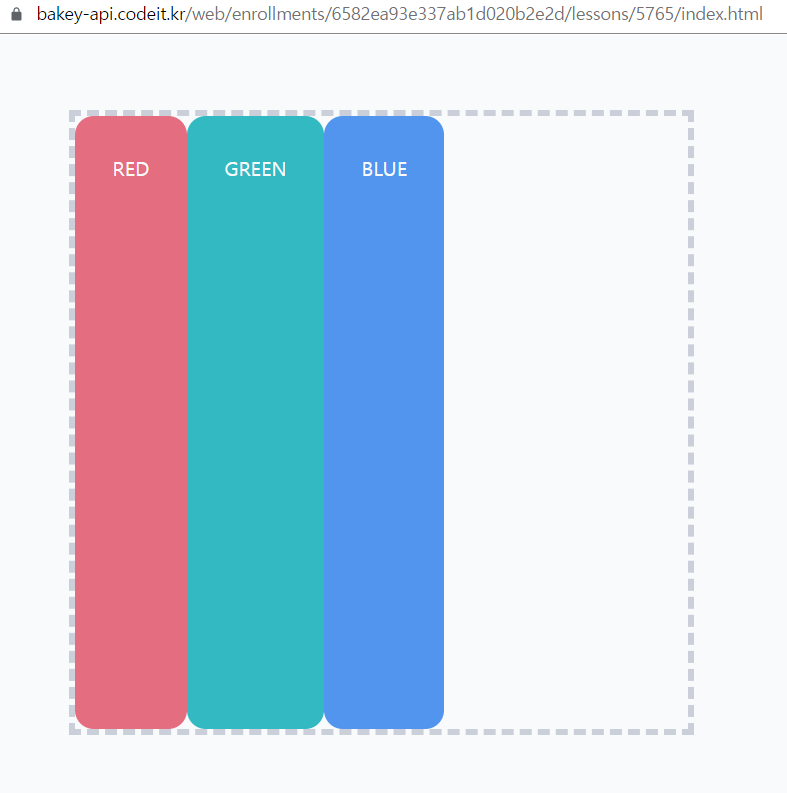
기본적으로 flexbox 방향이 가로이기 때문에 요소들이 왼쪽에서 오른쪽으로 배치됨.
.container {
  border: 5px dashed #cacfd9;
  width: 500px;
  height: 500px;
  display: flex;
  flex-direction: column;
}
정렬
기본 축 (Main Axis) : flex에서 요소가 배치되는 방향
교차 축 (Cross Axis) : 기본축에 수직인 방향
flex-direction: column;
기본축은 위에서 아래로, 교차축은 왼쪽에서 오른쪽으로 가는 방향임.
요소들은 기본축 방향으로 순서대로 배치되고, 교차축 방향으로는 꽉 채워서 배치함.
- 기본축 정렬 : justify-content (center, space-between)
- 교차축 정렬 : align-items
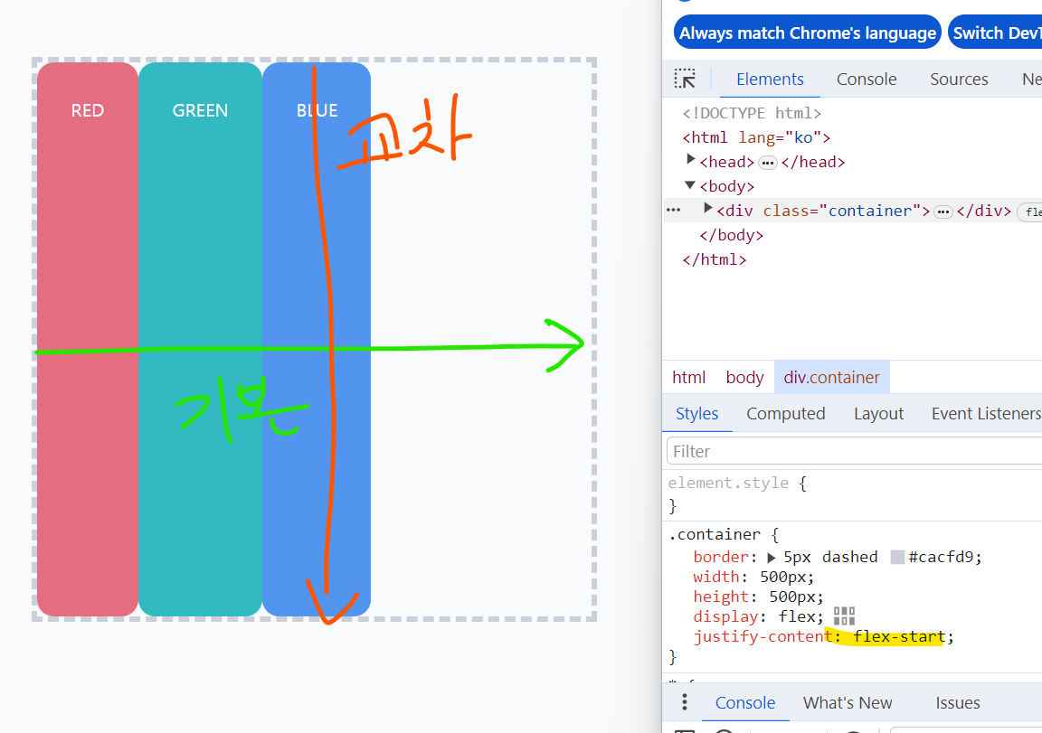
justify-content: flex-end; 기본축에서 맨 끝에 정렬됨.
justify-content: flex-start; 기본축에서 맨 앞에 정렬됨.

justify-content: space-around
기본축 방향에 모두 같은 공간이 생김.

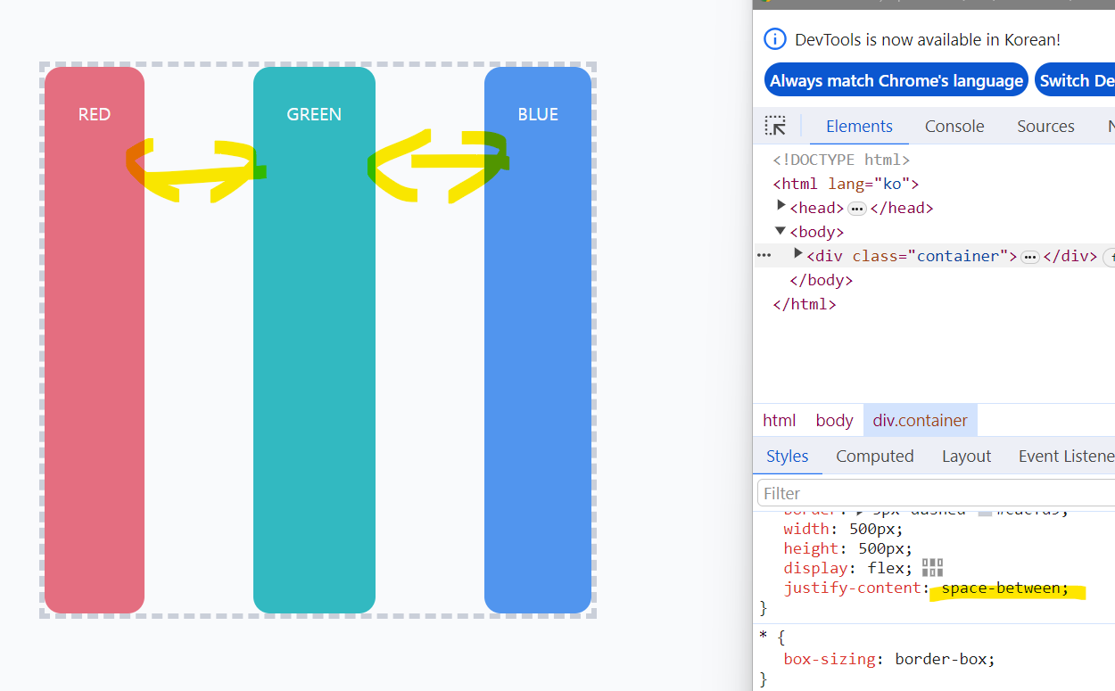
justify-content: space-between
기본축 방향으로 양끝을 늘어뜨려서 배치함.
align-items: center;
요소가 원래 크기만큼으로 배치됨.

요소가 넘칠 때
flex-wrap
.container {
  border: 5px dashed #cacfd9;
  width: 500px;
  height: 500px;
  display: flex;
  flex-wrap: wrap;
}
flex-wrap: wrap;
요소가 넘치면 교차축 방향으로 넘어가서 배치됨.


요소들 사이의 간격 넣기
맨 마지막 박스를 제외한 모든 박스의 오른쪽 마진이 30px만큼 생김.
.box:not(:last-child) {
  margin-right: 30px;
}
속성 gap을 활용하여 flexbox 요소 안의 간격을 조절할 수 있음.
.container {
  border: 5px dashed #cacfd9;
  width: 500px;
  height: 500px;
  display: flex;
  gap: 30px;
}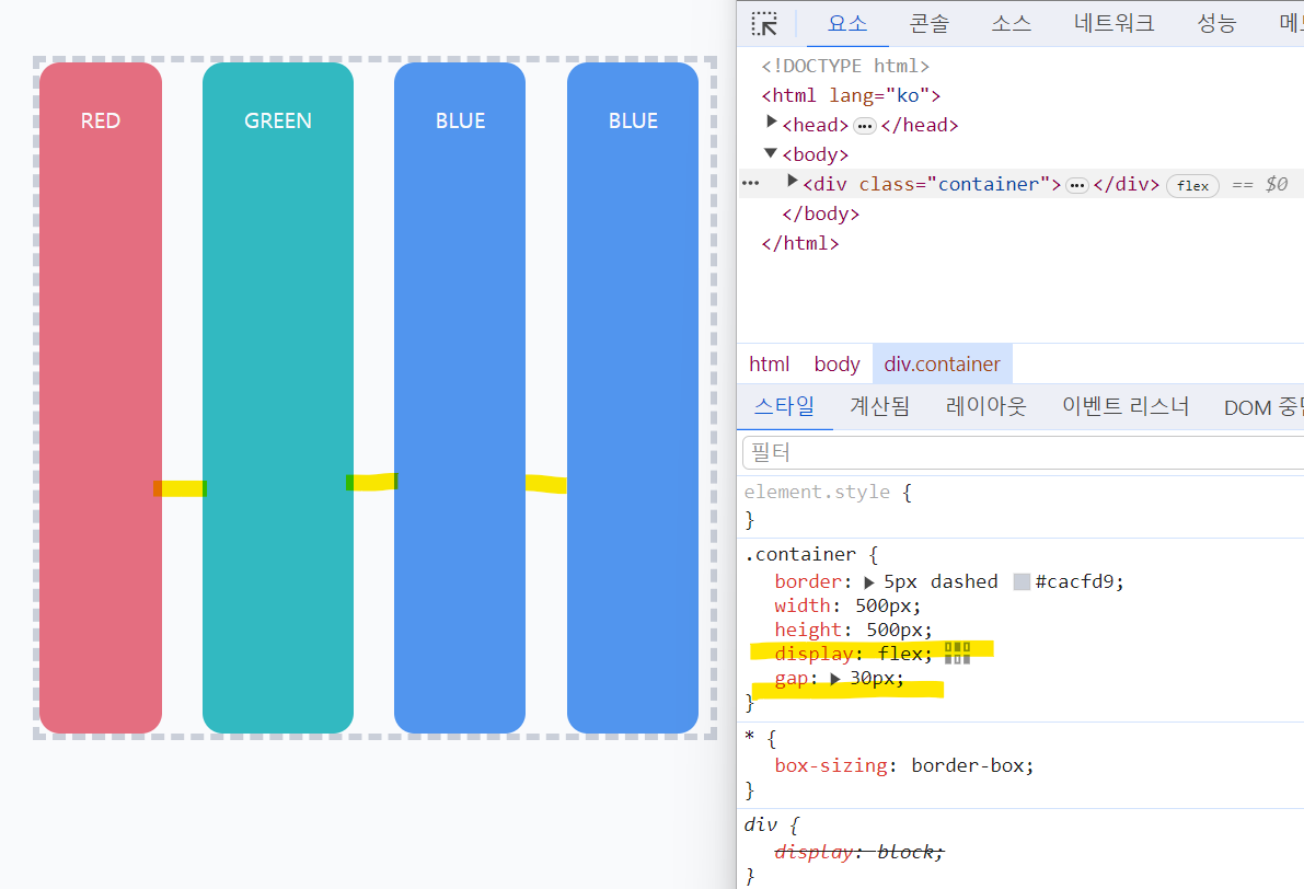
여기서 div 태그들은 글자만큼 간격을 차지하기 때문에 크기가 각각 다름.
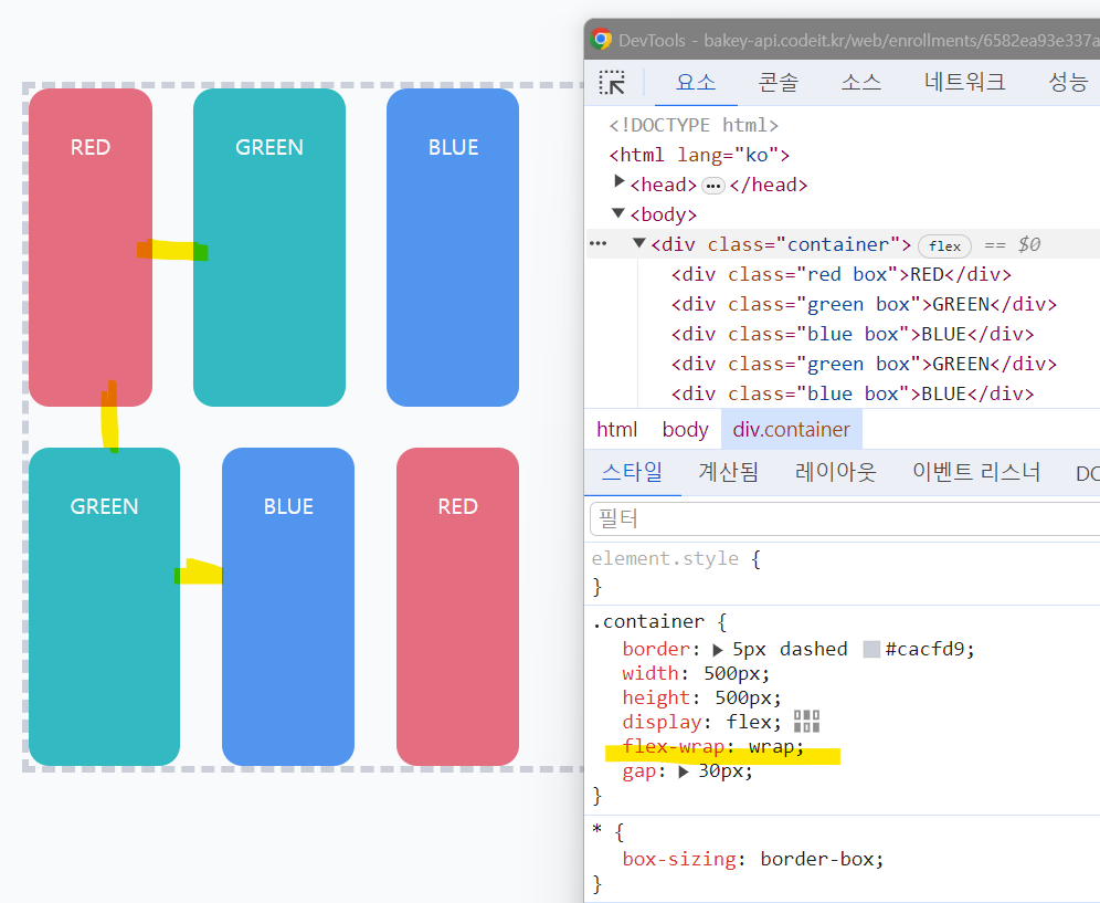
flex-wrap: wrap으로 넘치는 요소를 넘어가도록 함.
이때 요소들끼리의 모든 간격(가로 및 세로)가 30px로 지정됨.
.container {
  border: 5px dashed #cacfd9;
  width: 500px;
  height: 500px;
  display: flex;
  flex-wrap: wrap;
  gap: 30px;
}
gap의 속성값으로 가로 간격과 세로 간격을 별도로 지정할 수 있음.
교차축과 관계없이 무조건 세로-가로 순서임. (margin 쓸 때 순서와 같음)
  flex-wrap: wrap;
  gap: 30px 60px;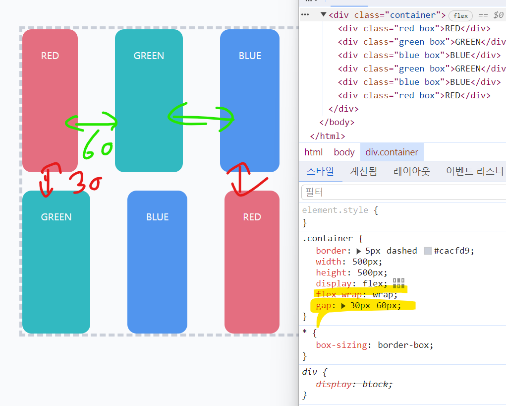
요소 꽉 채우기
flex-grow와 flex-shrink는 값이 클수록 더 커짐/작아짐.
자주 사용하는 것
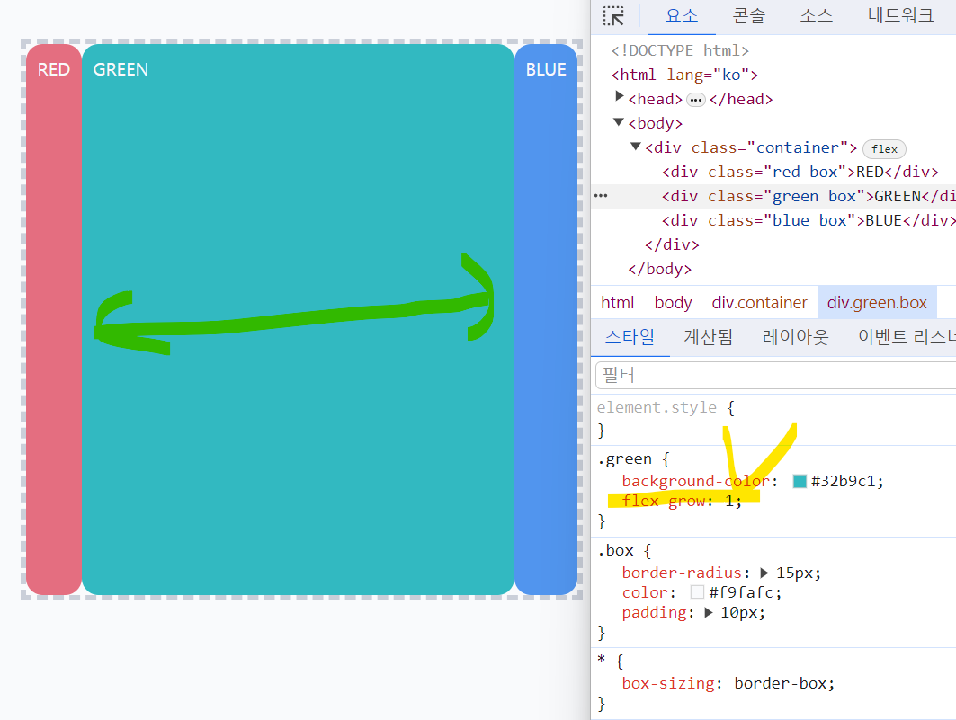
- flex-grow: 1; : 빈공간을 채우고 싶을 때
- flex-shrink: 0; : 어떤 요소의 크기를 내가 원하는대로 고정하고 싶을 때
.green {
  background-color: #32b9c1;
  flex-grow: 1;
}
.green {
  background-color: #32b9c1;
  flex-grow: 1;
}

.blue {
  background-color: #5195ee;
  flex-grow: 2;
}
flex-grow 속성값으로 지정해주는 숫자는 상대적인 값
숫자에 비례하여 크기가 더 많이 늘어나게 됨.
flex-shrink 자동적용 되는 경우
.container {
  border: 5px dashed #cacfd9;
  width: 500px;
  height: 500px;
  display: flex;
}

.box {
  border-radius: 15px;
  color: #f9fafc;
  padding: 10px;
  width: 300px;
}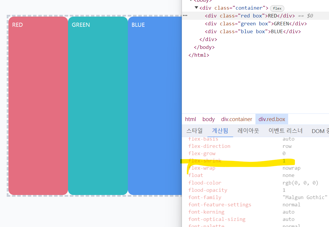
flex-box 공간의 너비가 500px인데, 각 요소가 300px이라서 바깥으로 삐져나올 것 같았으나,
그냥 flex-shrink값이 1로 자동 생성되어 너비가 똑같이 됨.
flex-shrink
.red {
  background-color: #e46e80;
  flex-shrink: 0;
}

.green {
  background-color: #32b9c1;
}

.blue {
  background-color: #5195ee;
  flex-shrink: 2;
}
red는 지정한 크기 그대로, green은 shrink 1, blue는 shrink 2라서 shrink가 클수록 더 많이 줄어드는 걸 알 수 있음.
플렉스 요소의 크기
width 속성으로 시작 크기를 지정하기
flex-grow: 1;
flex-shrink: 0;
width: 100px;
flex-basis 속성으로 시작 크기를 지정하기
flex-grow: 1;
flex-shrink: 0;
flex-basis: 100px;
flex 속성으로 짧게 쓰기
flex: 1 0 100px;Flexbox 정리
플렉스 박스 생성 : display: flex;
기본 축 정렬 : justify-content
- justify-content: flex-start (기본값)
- justify-content: flex-end (기본값)
- justify-content: center (기본값)
- justify-content: space-between (기본값)
교차 축 정렬 : align-items
- align-items : stretch (기본값, 늘려서 배치)
- align-items : flex-start
- align-items : center
- align-items : flex-end
요소가 넘칠 때 flex-wrap: wrap으로 넘어감.
간격: gap (세로 - 가로)
요소 늘려서 채우기: flex-grow
요소 줄여서 채우기: flex-shrink
둘 다 값이 클수록 많이 늘어남/줄어듦.
flex-basis : flex item의 초기 크기
인라인 안에서 Flexbox 만들기
인라인요소 안에서 flexbox를 만들고 싶을 때 속성값으로 inline-flex를 지정한다.
.new-window-link {
  display: inline-flex;
  align-items: center;
  gap: 4px;
}
display에 flex를 하는 경우 다음줄로 넘어가버림.
Flexbox 안에서 포지셔닝하기
- Flexbox 안에서 배치되는 경우 : relative, sticky (요소의 원래 자리를 차지 O)
- Flexbox와 무관하게 배치되는 경우 : absolute, fixed (요소의 원래 자리를 차지 X)
3. Grid
Grid
· 두 방향, 2차원으로 배치할 수 있는 방법
· 바둑판 같은 배치 (좌 → 우, 상 → 하)
· Grid Line : 칸을 나누는 줄, Grid Cell : 칸 내용
- 격자 나누기 : grid-template-rows(columns)
- 간격 : gap
- 크기 미리 정하기 : grid-auto-rows(columns)
- 원하는 위치에, 여러 칸에 걸쳐서 배치 : grid-row(column), span
- 이름으로 배치 : grid-area, grid-template-areas
Grid 나누기
.container {
  border: 5px dashed #cacfd9;
  width: 500px;
  height: 500px;
  display: grid;
  grid-template-columns: 100px 300px 100px;
}
.container {
  border: 5px dashed #cacfd9;
  width: 500px;
  height: 500px;
  display: grid;
  grid-template-columns: 100px 300px 100px;
  grid-template-rows: 200px 200px 100px;
}
grid-template: row / column으로 지정해주면 됨.
.container {
  border: 5px dashed #cacfd9;
  width: 500px;
  height: 500px;
  display: grid;
  /* grid 순서 : 세로(row) - 가로(column) */
  grid-template:
    200px 200px 100px /
    100px 300px 100px;
}
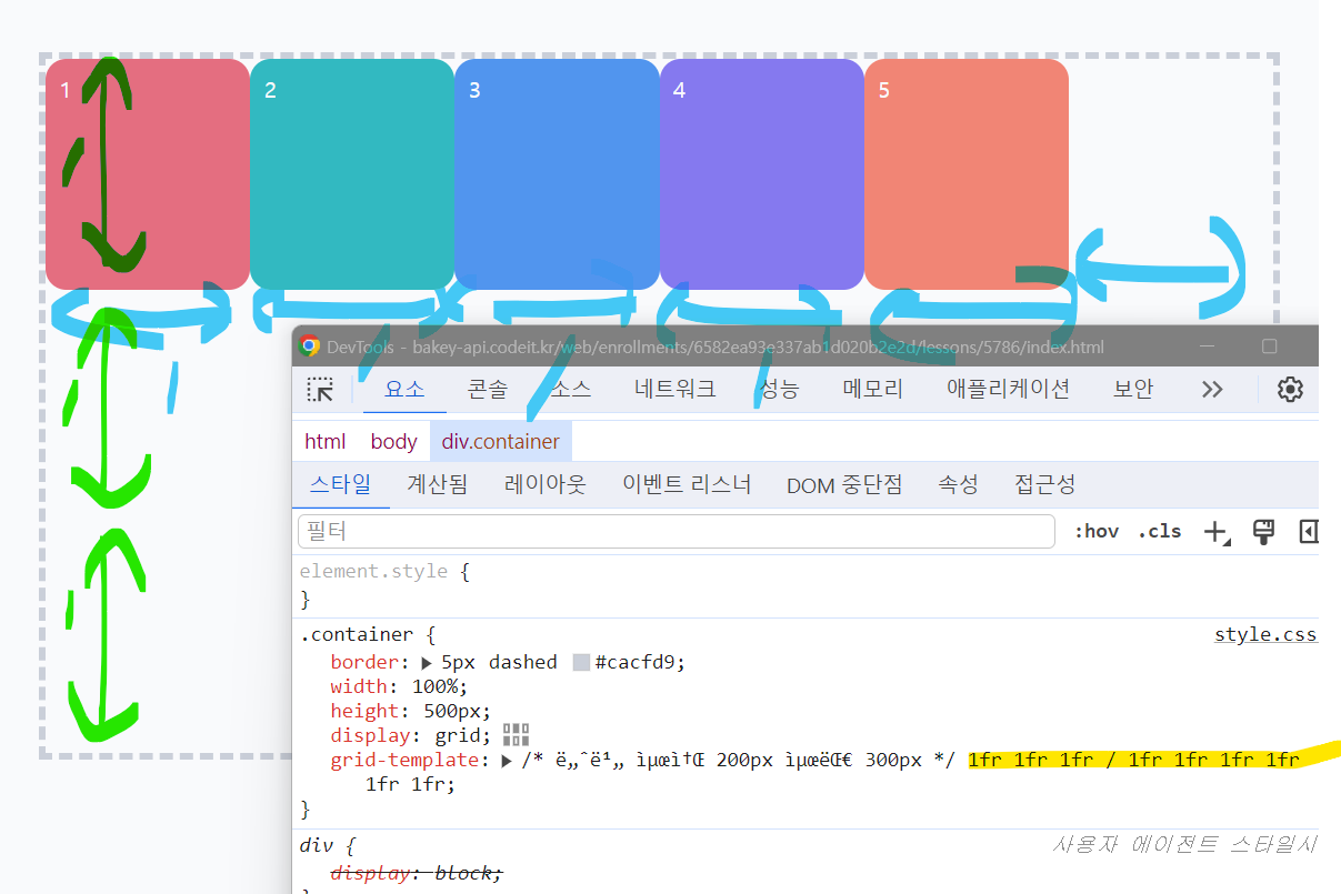
유연한 크기와 유용한 함수들
1fr 1fr 1fr : 1 : 1 : 1의 비율로 삼등분
fr(fraction) : 그리드 공간 안에서 부분을 상대적으로 나누는 단위
브라우저 창의 크기를 늘렸다가 줄이면 크기가 유연하게 변함.
.container {
  border: 5px dashed #cacfd9;
  width: 500px;
  height: 500px;
  display: grid;
  grid-template:
    1fr 1fr 1fr /
    1fr 1fr 1fr;
}
    1fr 2fr 1fr /
    /* 너비 최소 200px 최대 300px */
    minmax(200px, 300px) minmax(200px, 300px);
최솟값에는 fr 불가능, 최댓값에는 fr 가능함.
여기서 minmax가 2개인데, 각각 첫번째와 두번째 column에 적용됨.
너비를 최소 200px, 최대 1fr → 크기가 작을 때 최소 200px 유지하다가 점점 커질수록 1:1 비율을 유지함.
.container {
  border: 5px dashed #cacfd9;
  width: 100%;
  height: 500px;
  display: grid;
  grid-template:
    /* 너비 최소 200px 최대 300px */
    1fr 1fr 1fr /
    1fr 1fr 1fr 1fr 1fr 1fr;
}
repeat 함수를 써서 반복을 줄일 수 있다.
repeat(반복횟수, 1fr)
.container {
border: 5px dashed #cacfd9;
width: 100%;
height: 500px;
display: grid;
grid-template:
/* row 3, column 6 --> 6 * 3 */
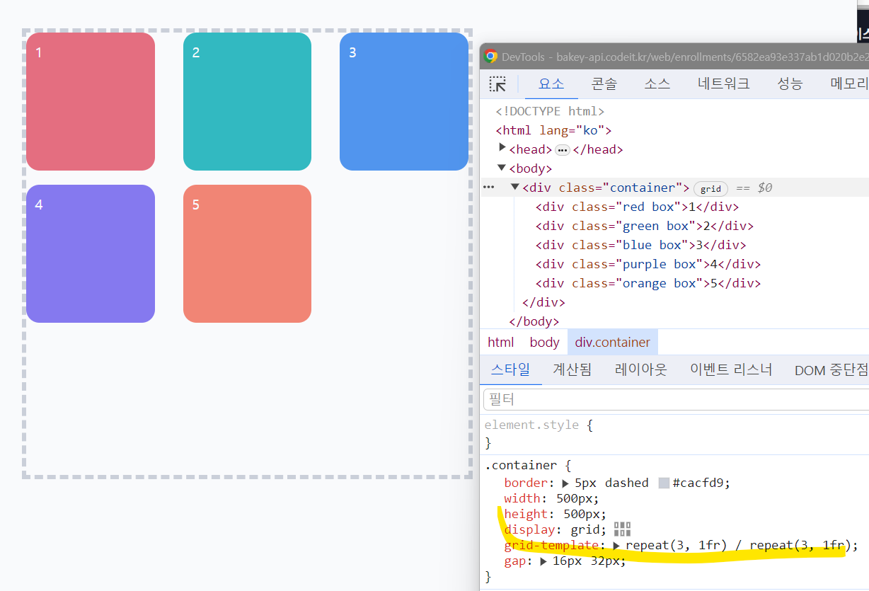
repeat(3, 1fr) /repeat(6, 1fr);
}
요소의 최소와 최대 너비와 높이를 지정하는 방법
.element {
  /* 최소 너비 100px, 최대 너비 300px */
  min-width: 100px;
  max-width: 300px;

  /* 최소 높이 50px, 최대 높이 200px */
  min-height: 50px;
  max-height: 200px;
}
간격 넣기
gap 속성을 사용하면 됨 (16px)
gap: row(세로간격), column(가로간격);
.container {
  border: 5px dashed #cacfd9;
  width: 500px;
  height: 500px;
  display: grid;
  grid-template:
    repeat(3, 1fr) /
    repeat(3, 1fr);
  gap: 16px 32px;
}
크기 미리 정해두기
- grid-auto-rows로 다음에 연달아 올 요소들의 높이를 미리 지정해주기
- grid-template-columns로 columns는 배치해두고, grid-auto-rows 속성만 별도로 지정해줌.
.container {
  border: 5px dashed #cacfd9;
  width: 500px;
  height: 500px;
  display: grid;
  grid-template-columns: repeat(3, 1fr);
  grid-auto-rows: 200px;
  gap: 16px 32px;
}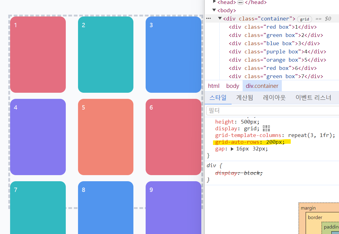
row의 높이를 번갈아가면서 지정할 수도 있음.
.container {
  border: 5px dashed #cacfd9;
  width: 500px;
  height: 500px;
  display: grid;
  grid-template-columns: repeat(3, 1fr);
  grid-auto-rows: 200px 100px 50px;
  gap: 16px 32px;
}
원하는 위치에 요소 배치하기
- grid-row: (시작위치) (끝나는 위치)
- grid-row : (시작위치) (span 숫자)(크기)
세번째 row라인과 두번째 column이 교차하는 지점에 배치됨.
나머지 요소들은 위에서 차례대로 배치됨.
grid-row: 3;
grid-column: 2;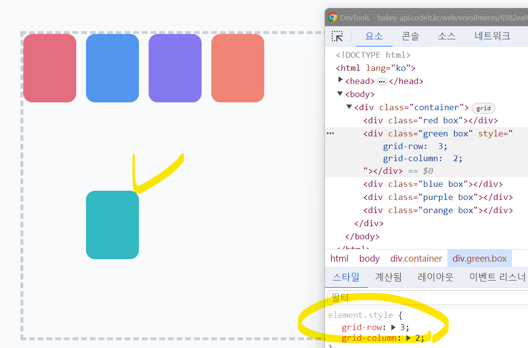
이때 속성값은 cell의 번호가 아니라 line의 번호임.
순서대로 1, 2, 3 (위 → 아래, 왼쪽 → 오른쪽), 거꾸로 -1, -2, -3 (아래 → 위, 오른쪽 → 왼쪽)
grid-row: 3 / 5;
grid-column: 2 / -2;
span으로 크기를 지정해줄 수 있음.
span 3은 세 칸을 차지하도록 함.
grid-row: 3 / span 2;
grid-column: 2 / span 3;
이름으로 배치하기
- grid-template-areas : 배치하고 싶은대로 배치하기 (비워두고 싶은 부분은 마침표)
- grid-area : (이름)
.container {
  border: 5px dashed #cacfd9;
  width: 500px;
  height: 500px;
  display: grid;
  grid-template:
    repeat(2, 1fr) /
    repeat(2, 1fr);
  gap: 16px;
  grid-template-areas: "r g" "r b";
}
.red {
background-color: #e46e80;
grid-area: r;
}
.green {
background-color: #32b9c1;
grid-area: g;
}
.blue {
background-color: #5195ee;
grid-area: b;
}