교육/엘리스 SW 학습 내용
[엘리스sw] 13주차 3일 - styled-component
꼽파
2024. 3. 26. 09:56

◆ React Styling 방법론 소개
◆ JavaScript template literal
◆ styled component 기본기
React Styling 방법론 소개
- CSS module : CSS module
- CSS in JS library : CSS in JS library
- UI framework : UI framework
- CSS framework : w3.css
CSS Module
- class, id 등에 random string을 달아주기 때문에 선택자가 겹칠 우려가 없음.
- 스타일 충돌을 방지하고 코드를 격리하여 체계적으로 CSS 설계가 가능
- 스타일링을 직접 하나하나 해야 함.
- 하나의 스타일 sheet가 여러 컴포넌트에 영향을 미침.
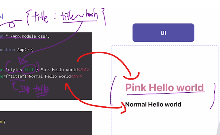
App.jsx
import styles from "./app.module.css";

export default function App() {
	return (
		<div>
			<h1 className={styles.title}>Pink Hello world</h1>
			<h1 className={"title"}>Normal Hello world</h1>
		</div>
	);
}
app.module.css
h1 {
	font-size: 1.5rem;
}

.title {
	font-size: 2.5rem;
	color: palevioletred;
}
UI framework
- Ant Design, Material UI
- 이미 다 만들어져 있어서 간편하고 쉽게 쓰기에 좋음.
- 이미 다 만들어져 있어서 styling의 학습 및 훈련이 필요한 초심자들에게는 비추천.
- 해당 framework의 디자인철학을 벗어나기 쉽지 않음.
- 컴포넌트들을 커스터마이징 하기 어려움.
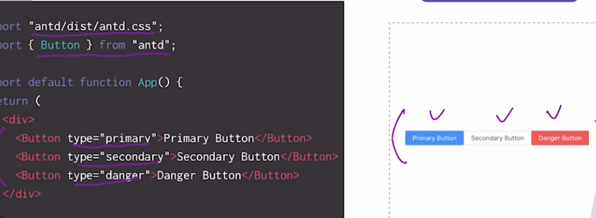
import "antd/dist/antd.css";
import { Button } from "antd";

export default function App() {
	return (
    	<div>
        	<Button type="primary">Primary Button</Button>
            <Button type="secondary">Secondary Button</Button>
            <Button type="danger">Danger Button</Button>
    	</div>
    )
}
CSS framework
- W3CSS, TailwindCSS
- 거대한 CSS 파일 하나를 가져오는 것임
- 개발자가 따로 CSS파일을 작성하지 않아도 HTML에 클래스만 적어주면 정해진 규칙대로 스타일링이 적용됨.
- CSS에 대한 이해력이 있어도 해당 framework를 사용하기 위한 학습을 또다시 해야 함.
- 이미 다 만들어져 있어서 styling의 학습 및 훈련이 필요한 초심자들에게는 비추천.
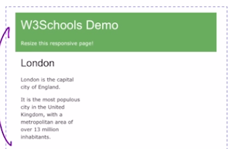
W3CSS 예시
App.jsx
import { helmet } from "react-helmet";

export default function App() {
	return (
		<div>
			<Helmet>
			<link
				rel="stylesheet"
				href="https://www.w3schools.com/w3css/4/w3.css" />
			</Helmet>
			<div className="w3-container w3-green">
				<h1>W3Schools Demo</h1>
				<p>Resize this responsive page!</p>
			</div>
			<div className="w3-row-padding">
				<div className="w3-third">
					<h2>London</h2>
					<p>London is the capital city of England</p>
					<p>It is the most populous city in the United Kingdom, with a metropolitan area of over 13 million inhabitants.
					</p>
				</div>
			</div>
		</div>
	);
}
CSS-in-JS library
- styled component, emotion
- 따로 CSS 파일 만들 것 없이 JSX 파일 안에서 스타일링까지 해결 가능함.
- 컴포넌트 재사용성이 쉬워짐.
- JS 값들을 props로 넘겨줘서 해당 JS 값에 의도된 styling을 바로 적용할 수 있음.
- class 이름에 random string이 생성되기 때문에 선택자 이름이 겹칠 우려가 없음.
- 스타일링을 직접 개발자가 하나하나 해야함.
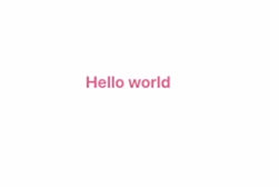
App.jsx
import styled from "styled-components";

const Title = styled.h1`
	font-size: 1.5rem;
    text-align: center;
    color: palevioletred;
`;

export default funtion App() {
	return <TItle>Hello World</Title>
}
JavaScript template literal
Template literals
- 내장된 표현식을 허용하는 문자열 리터럴
- 문자열 안에서 JS 표현식을 사용할 수 있게 하는 문법
→ Styled component를 사용하기 위한 기본 문법
`string text ${expression} string text`- `${string}` : Template literal 안에서 string 사용하기
const string = "elice"
const message = `hello ${string}`

console.log(message)
// 결과 : "hello elice"
Template literal과 String Concat 비교
String Concat
const name = "elice"
const age = 32
const where = "seoul"
const message = "hello" + name + ", I am" + age + "year old, and I am living in " + where

console.log(message)
// 결과: hello elice, I am 32 year old, and I am living in seoul
Template Literal
const name = "elice"
const age = 32
const where = "seoul"
const message = `hello ${name}, I am ${age}years old, and I am living in ${where}`

console.log(message)
// 결과: hello elice, I am 32 year old, and I am living in seoul
number
`${number}` : Template literal 안에서 number 사용하기
const number = 12345
const message = `hello ${number}`

console.log(message)
// 결과 : "hello 12345"
boolean
`${boolean}` : Template literal 안에서 boolean 사용하기
const boolean = true
const message = `hello ${boolean}`

console.log(message)
// 결과 : "hello true"
object
`${object}` : Template literal 안에서 object 사용하기
const object = { a: "apple" }
const message = `hello ${object}`

console.log(message)
// 결과 : "hello [object Object]"
ternary operator
`${expression}` : Template literal 안에서 expression 사용하기
const name = "chalie"
const gender = "male"
const message = `Hello ${gender === "male" ? "Mr." : "Mrs."}${name}, nice to meet you`

console.log(message)
// 결과 : "Hello Mr.chalie, nice to meet you"
styled component 기본기
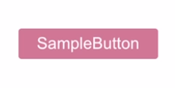
button 만들기
const Button = styled.button`
	font-size: 1em;
    margin: 1em;
    padding: 0.25em 1em;
    border: 2px solid palevioletred;
    border-radius: 3px;
    background: palevioletred;
    color: white;
`

function App(){
	return <Button>SampleButton</Button>
}
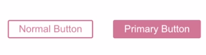
styled components 활용
const Button = styled.button`
	font-size: 1em;
	margin: 1em;
	padding: 0.25em 1em;
	border: 2px solid palevioletred;
	border-radius: 3px;
	background: ${props => props.primary ? "palevioletred" : "white"};
	color: ${props => props.primary ? "white" : "palevioletred" };
`

function App() {
	return (
		<div>
			<Button>Normal Button</Button>
			<Button primary>Primary Button</Button>
		</div>
	)
}
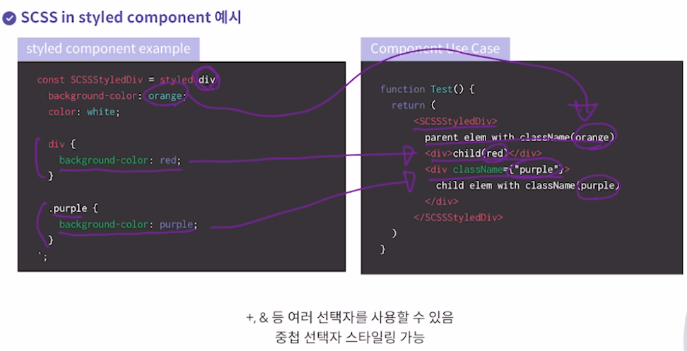
CSS와 SCSS 비교
CSS example
.name.red {
	color: red;
}
.name .blue {
	color: blue;
}
.name .child .yellow {
	color: yellow;
}
.name + .name {
	color: purple;
}
SCSS example
.name {
	&.red {
		color: red;
	}
	.blue {
		color: blue;
	}
	.green {
		color: green;
	}
	.child {
		.yello {
			color: yellow;
		}
	}
	+ .name {
		color: purple;
	}
}
SCSS에서는 선택자 중복 회피 가능
이 외에도 SCSS variable 등 여러 추가 기능 가능
728x90